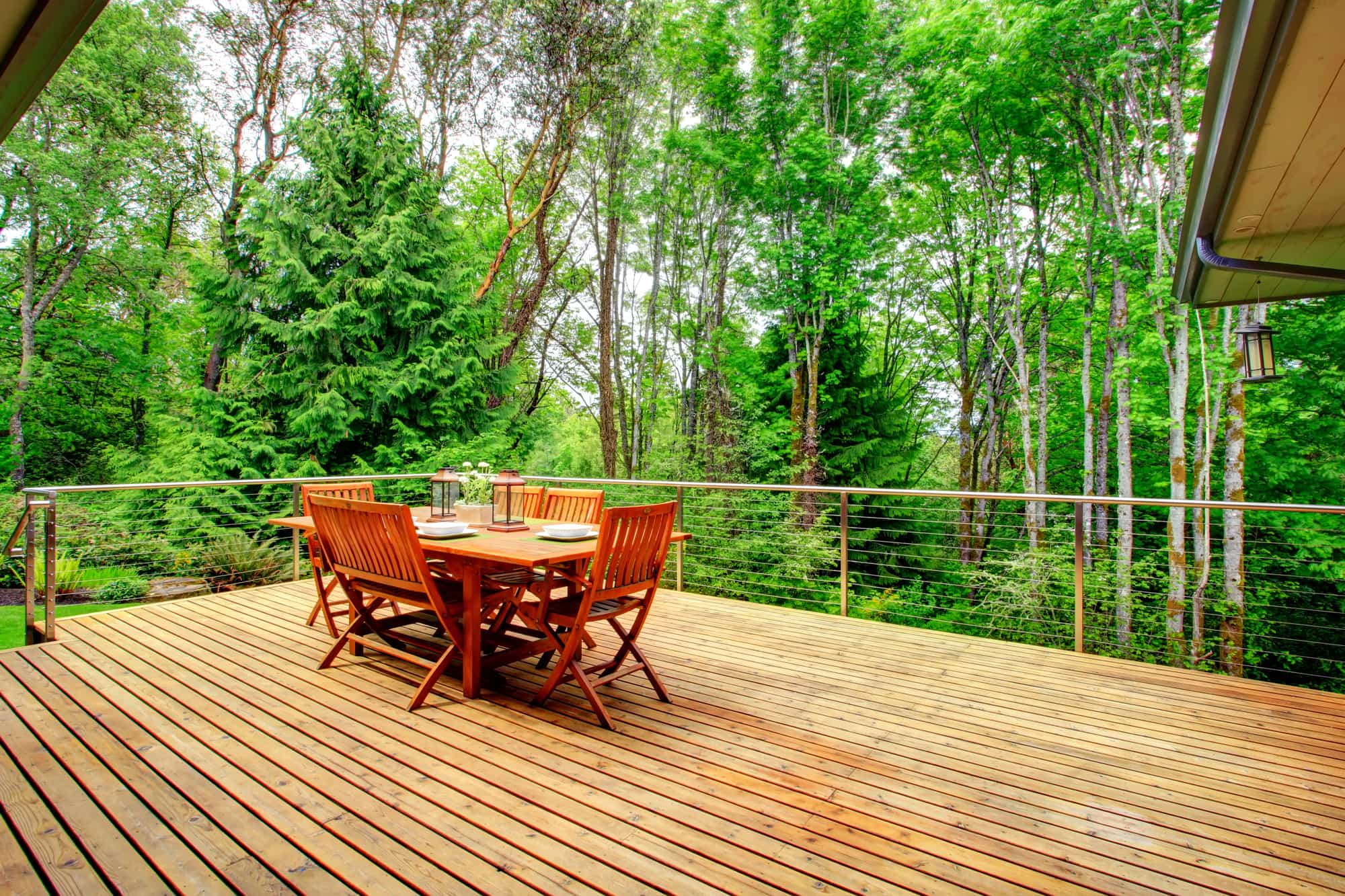
Get Your Deck Ready for Summer
April 30, 2019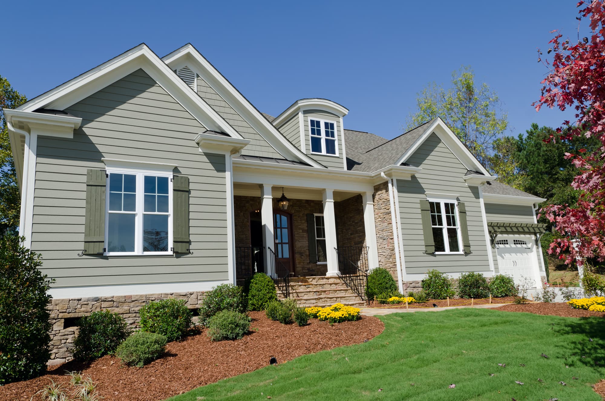
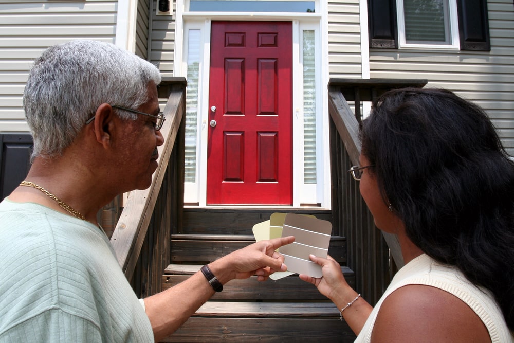
Refinish Your Exterior Siding with These Tips
May 31, 2019
Exterior spaces create a fantastic excuse to play around with color and explore the possibilities. This year’s trending color palette is full of hues that will inspire and invigorate the designer in anybody.
Pantone’s Color of the Year 2019
Last year was all about Ultraviolet, but 2019 welcomes in a more carefree, beachy hue: Living Coral. This color provides summertime warmth and vibrancy while adding a slight edge to interior and exterior designs. Consumers can expect to see this coral color everywhere from home decor to clothing to beauty products. Living Coral can bring a spark back to an outdoor space via a vivid door, or it can mellowly meld into the overall decor by showing up on the walls. The shade also pairs nicely with the trending color palette for this year. Here’s a closer look at those tones, which are being celebrated by brands such as Behr, Sherwin Williams, and more.
Blueprint: A Versatile Spin on Classic Denim
Behr named Blueprint their color of 2019, and while it falls into the denim shades category, this hue is a more versatile take on everyone’s favorite blue color. This tone sits comfortably between traditional denim and navy blue, making it a paint color that can fit just about any aesthetic. Looking for a romantic, intimate outdoor patio? Blueprint can do that. Want something more exciting and invigorating? Blueprint can handle that, too. Depending on how a person mixes and matches their paint colors, they can create just the right mood they’ve got in mind.
For example, Blueprint becomes bold and invigorating when paired with Golden Crest and Primavera, two other trending paint colors. Golden Crest provides a warm, marigold tone while Primavera ties everything together with its cool, lime green intensity. This color combo looks great with wooden accents, making a backyard or patio look fun and summertime ready.
Those looking for a more monochromatic theme can try out Celestial and Porcelain, which are also making waves this year. Celestial is a gorgeous blue with hints of gray, making it a more subdued partner to Blueprint. Adding Porcelain to the mix brings it all together and creates a balanced slate while keeping the area light and airy.
Two More Paint Colors to Try This Year
Playing up contrasts is always a fun way to bring more personality and energy to a space, whether outside or indoors. Cavern Clay is a burnt orange reminiscent of terracotta, and it looks absolutely stunning next to Blueprint. The juxtaposition of these two colors creates a visually appealing layout that makes a bold statement on a deck or patio.
Moreover, Alaea is a lovely merlot hue that fits into various color palettes. Try it with the monochromatic theme or use it to tone down the intensity of Golden Crest and Primavera. Or, pair it with Pantone’s Living Coral for something completely new. Alaea provides the elegance of violets without being in your face, such as last year’s Ultraviolet. Have fun mixing and matching colors from this year’s trending palette, and don’t be afraid to take risks with your outdoor living space!

Jeff Sommers is a vibrant and experienced professional, having been at the helm of ESP Painting, Inc. for 27 remarkable years. As President, he has become an esteemed leader in the Commercial & Residential Construction industry in Oregon, United States. His experience has seen him gain valuable insight and knowledge, making him an invaluable asset to ESP Painting and its customers. With a bubbly personality and upbeat attitude, Jeff always looks ahead to the future as he continues his leadership journey toward success.

