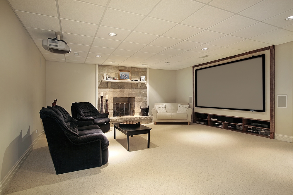
What Color Should You Paint a Dark Basement?
June 23, 2020
Tips for Painting an Access Wall
July 28, 2020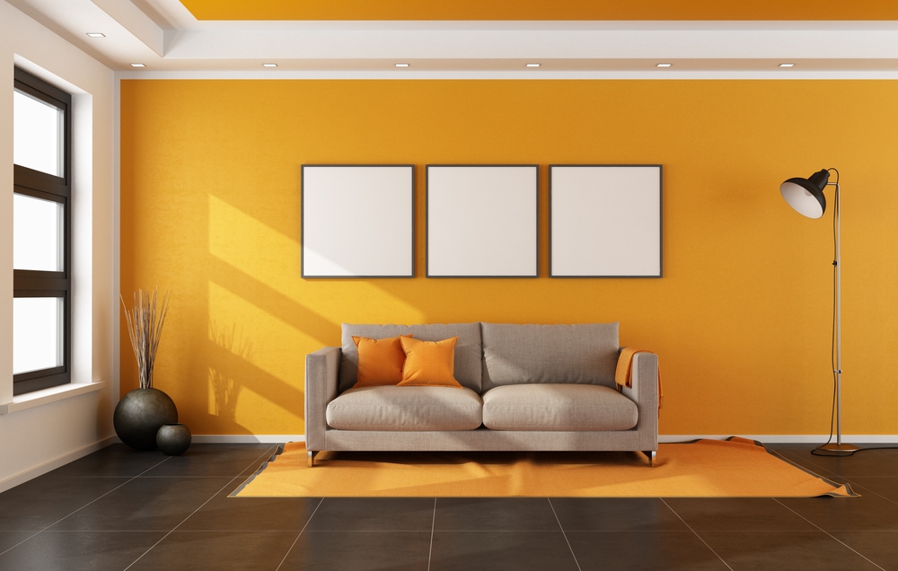
There’s nothing inherently wrong with experimenting with different color combinations with your interior décor. On the contrary, failing to experiment is how you get drab color schemes that add nothing to your interior and maybe even take away from it to an extent – because who wants to spend time in a room that looks so deathly dull?
That said, that doesn’t mean every experiment is a success. Just as there are some fashion choices you might wish you could take back (see: legwarmers) there are some wall painting and interior coloring experiments that just don’t pan out – and you don’t want to pay to have to remove them.
These five interior décor faux pas should be avoided at all costs.
- Flat Grey
Imagine the dullest color you can think of, and then stop because this is it right here. That doesn’t mean grey can’t be a great color to add to your interior, and there are plenty of gunmetal, metallic, and cool greys which can do wonders for the right décor setup.
But a massive slab of flat, dull, basic grey covering an entire wall? Forget “living in black and white,” grey walls should be the go-to metaphor for living in a world of dull dreariness. This is especially true if you’re using matte paint with no reflective gloss.
- Unbroken Orange
Are you an Oompa Loompa? Then chances are you shouldn’t be painting the entire interior décor the color of one. There’s nothing wrong with orange as an accent color – on the contrary, it can be used to paint a picture of topical exoticism and add some juice onto your home décor. However, while Willy Wonka may not think there’s such a thing as “over the top,” there is, and this is it. A solid wall of unbroken orange can appear distractingly bright when the light hits it.
- Noncomplementary Colors
Red and green are at opposite ends of the color wheel. In a work of art, that could make for some dazzling color contrast. Their opposition in Edvard Munch’s “The Sick Child” highlights the visceral agony of the scene.
However, chances are “agony” is the last thing you want to evoke in your home décor. For color pairings, you instead want to choose complementary colors (red/orange, blue/green, and so on).
- Solid Black
Are you an emo/goth teenager? If not, then a solid black wall probably isn’t a good idea. It’s way too dark, makes rooms seem uninteresting and uninviting, and given the cultural context, doesn’t have much personality beyond “I Listen to Bad Emo Music.”
- Solid Yellow
On the opposite end of the spectrum, unless you live in a bright cartoon world out of Disney Channel or Nick Jr., chances are you want to avoid a solid yellow field. Yellow has the opposite problem of black, reflecting way too much light and making it appear as though your guests are being welcomed into an over-cheery playhouse. If you really want an intensely bright appearance, you can’t beat yellow, but if you want a softer yet still sunny décor scheme, it’s better to try a shade of something else.
By avoiding these color mistakes, you can still experiment while avoiding some of the worst decorating fashion faux pas.

Jeff Sommers is a vibrant and experienced professional, having been at the helm of ESP Painting, Inc. for 27 remarkable years. As President, he has become an esteemed leader in the Commercial & Residential Construction industry in Oregon, United States. His experience has seen him gain valuable insight and knowledge, making him an invaluable asset to ESP Painting and its customers. With a bubbly personality and upbeat attitude, Jeff always looks ahead to the future as he continues his leadership journey toward success.


